

A tooth with a family tree growing inside it.
Figtree treats grandparents, parents and kids in the same chair. The brief: make the dentist somewhere you’d bring the whole family. So we started with roots.
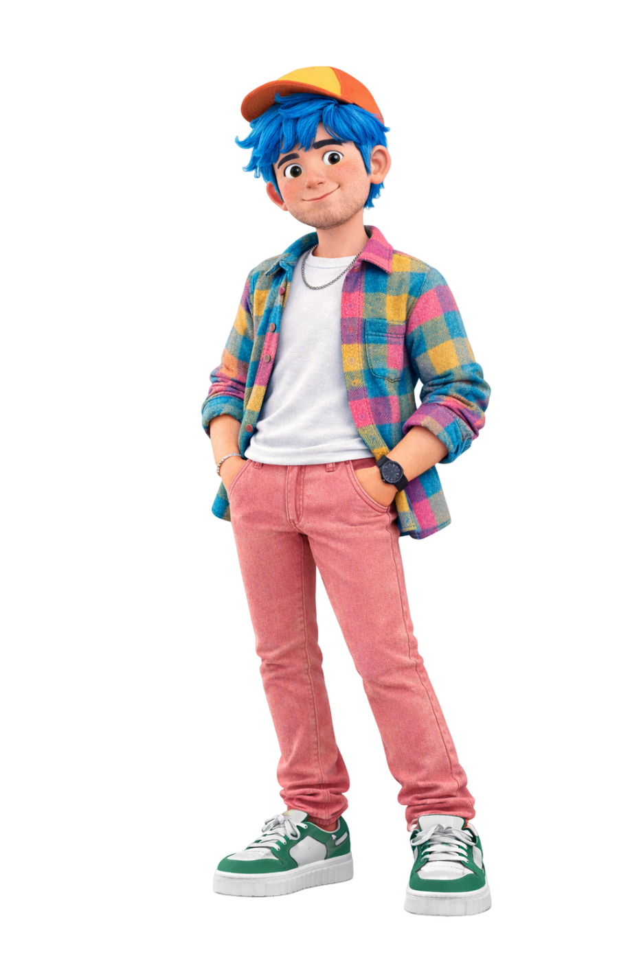

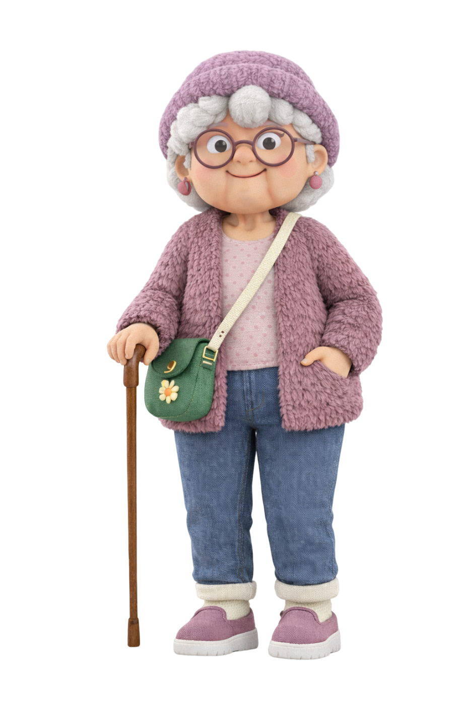
Most dental brands talk to one patient. Figtree’s chairs hold three generations a day: a nervous six-year-old, a busy parent, a grandmother who has seen every kind of dentist. Hospital blue and stock smiles scared off the first and bored the other two.
We designed for the whole family at once. One mark that holds a tooth and a tree, a palette that feels fresh instead of clinical, and a cast of three characters who show up together wherever the brand does.
Where Figtree sits.
Before anything was drawn, we agreed one sentence. Every design decision after it was checked against it.

Roots are what a dentist protects. And what a family shares.
One shape, two readings. At favicon size it’s a tooth. Up close, a tree with eleven leaves.
Mint, not hospital blue. Fresh breath and clean hands, without the clinical chill.
Soft everything. Round type, filled icons, fuzzy 3D shapes. Nothing sharp in a dental office.
Pick a colour. The right lockup steps in, so the logo never fights its background.







Real faces on brand colour.
Every age group gets a real face, cut out and set on flat Figtree colour, with the fuzzy shapes for company. Here is how that looks on a billboard, a post and a waiting-room poster.



Real people, natural smiles. No posed stock grins.
Cut-outs always sit on a flat brand colour.
3D characters talk to kids. Photos talk to adults.
Liked what we did for Figtree?
Book a free 30-minute session. Tell us where your brand is now and where you want it to go, and we’ll tell you honestly what it would take. Got a quick question instead? Just ask.