Cosmetic dentistry is a considered purchase. Patients compare clinics like they compare hotels, and a clinical look tells them the experience will feel clinical too.
Borrow the codes of beauty and hospitality. A flower-like star, a fine serif with wide letterspacing, a muted botanical palette, and a pattern of petals that frames every service.
Where Luminis sits.
Before anything was drawn, we agreed one sentence. Every design decision after it was checked against it.
Light, in bloom.
Lumen means light. The star’s eight petals radiate from the centre, the glow of a new smile.
The tooth sits protected. It rests in the heart of the bloom, held rather than displayed.
A boutique, not a chain. The Luminis serif and the spaced “DENTAL BOUTIQUE” line read like a fashion house, not a practice.
A palette from the garden.
Evergreen, olive and sage instead of clinical white. Blush and cream bring warmth to the skin tones in every photo.
Every service, framed by the bloom.
Each service icon sits inside the star, so even a price list or a treatment menu feels part of the boutique. For patients under 18, a friendlier headline font steps in while the rest of the system stays the same.
Botanical calm.
Deep teal, muted sage and warm gold. Photos sit inside an arch, framed by the bloom, so every service feels like a quiet boutique.



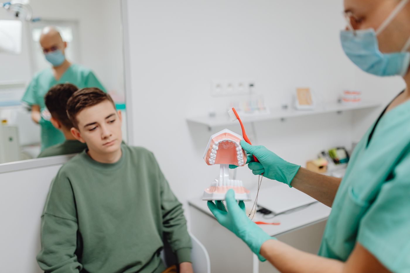
Muted greens, warm gold, deep teal shadows.
Photos sit inside the arch.
Calm faces and slow moments.
Example photography from Pexels, used to show the direction.
Liked what we did for Luminis?
Book a free 30-minute session. Tell us where your brand is now and where you want it to go, and we’ll tell you honestly what it would take. Got a quick question instead? Just ask.