
A circle of care, drawn around the person.
Families choosing a carer for a parent are anxious, and most of the category looks like a hospital leaflet. Silver Circle is a premium service in someone’s own home. We made it look like one.

Choosing care for a parent is one of the hardest calls a family makes. The category answers that worry with clip-art hearts and hospital blue. Silver Circle offers a premium, personal service and had to look trustworthy before anyone picked up the phone.
Treat it like hospitality, not healthcare. A seal-like ring, warm burgundy and linen, a gentle serif, close-up portraits that show age with dignity, and uniforms that make every carer look the part at the door.
Where Silver Circle sits.
Before anything was drawn, we agreed one sentence. Every design decision after it was checked against it.
One fine line around the name. A circle has no end, like the care. It also reads as a seal: the quiet signature of something premium.
Concentric lines, like growth rings in wood. Every ring a year lived. Age shown as character, never as frailty.
Every icon is built around open hands. Helping, never handling.
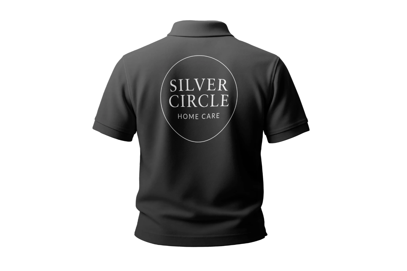
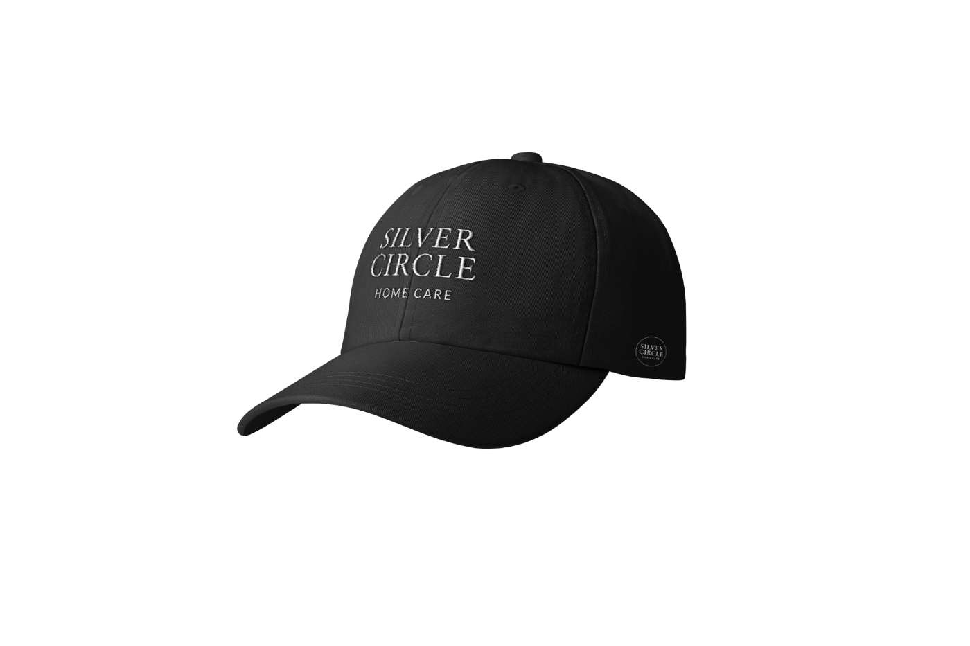
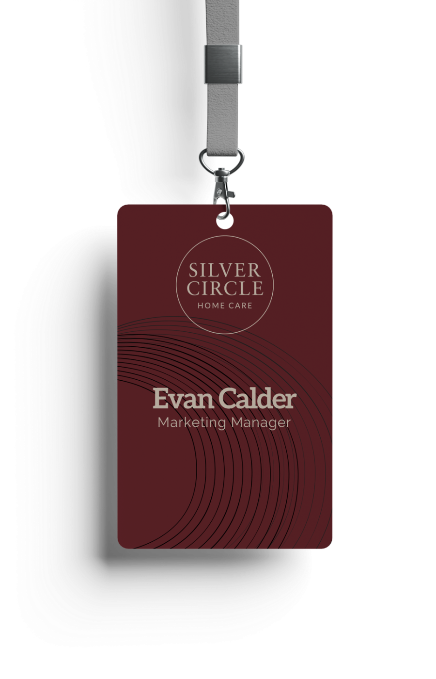
The carer is the brand at the front door.
Polos, caps and ID cards make every carer look the part before they say a word. That first knock is where the luxury is won or lost.

Close, warm, black and white.
People in mono, cropped close. Burgundy and the circle carry the brand, framing every photo like a family album.

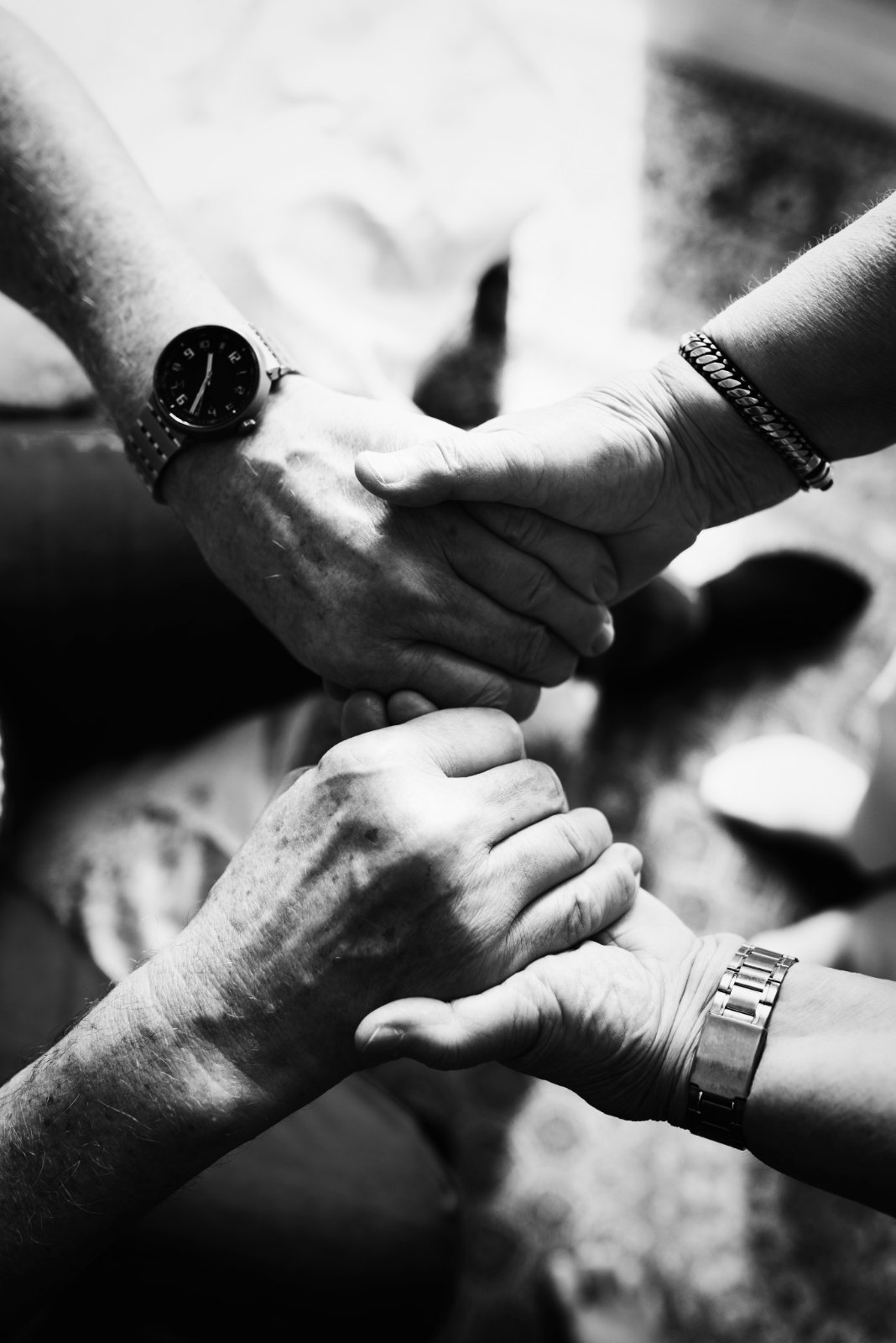
People in mono. Colour belongs to the brand.
Crop close: hands, eyes, laughter lines.
The circle frames portraits, like a family album.
Liked what we did for Silver Circle?
Book a free 30-minute session. Tell us where your brand is now and where you want it to go, and we’ll tell you honestly what it would take. Got a quick question instead? Just ask.