1Oak
Long-term value, grown like an oak.
“We’re a family investment firm, inspired by long-term value creation in a sustainable future.” The 2024 identity gives 1Oak a mark and a voice that feel patient, warm and built to last.
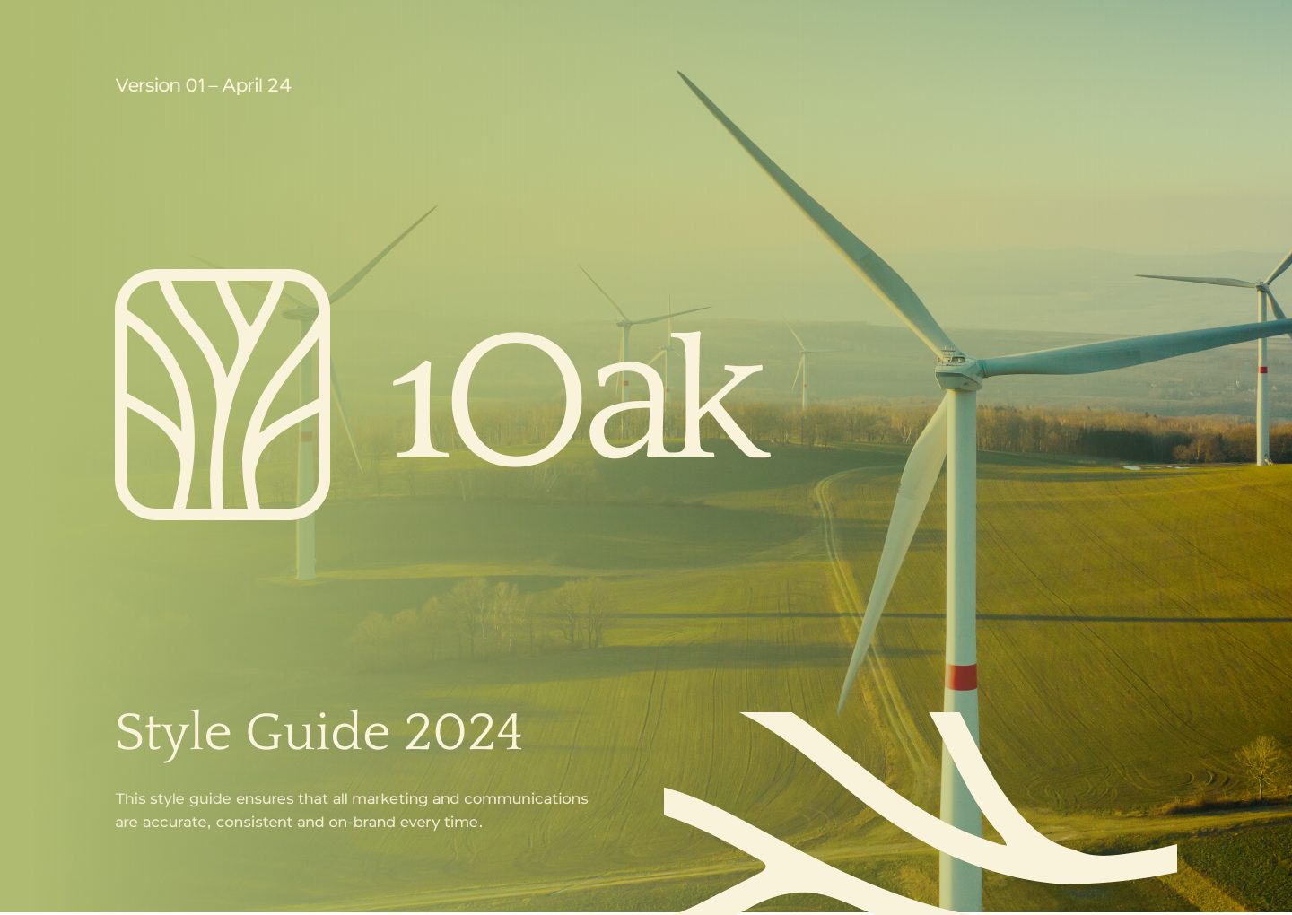
Investment brands tend to look cold. 1Oak backs energy and industrial projects for the long run, and wanted to feel steady and trustworthy without looking like a bank.
An oak tree drawn inside a rounded square, branches that reach across layouts, and olive greens warmed with ochre. Quattrocento gives titles a classic feel; Optika keeps the body copy clean.
A tree in a square.
The mark grows from the mission: long-term value, rooted and patient. Horizontal, vertical and icon-only versions share one clear-space rule.
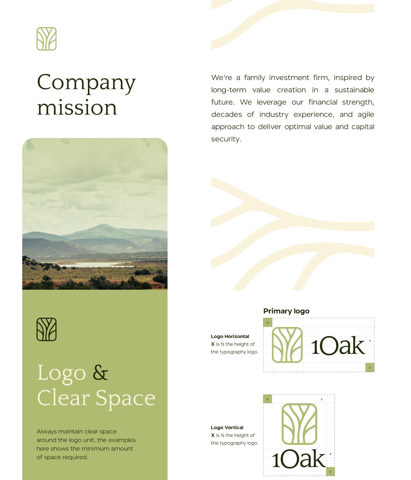
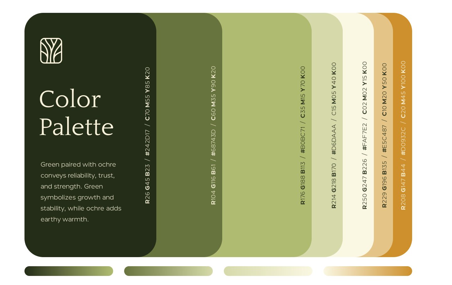
Green for growth, ochre for warmth.
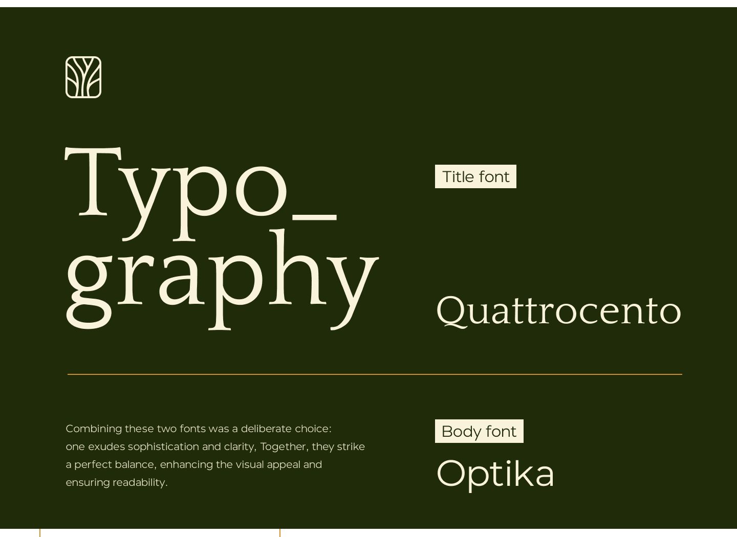
Quattrocento for titles, Optika for text. One adds character; the other keeps things clear.
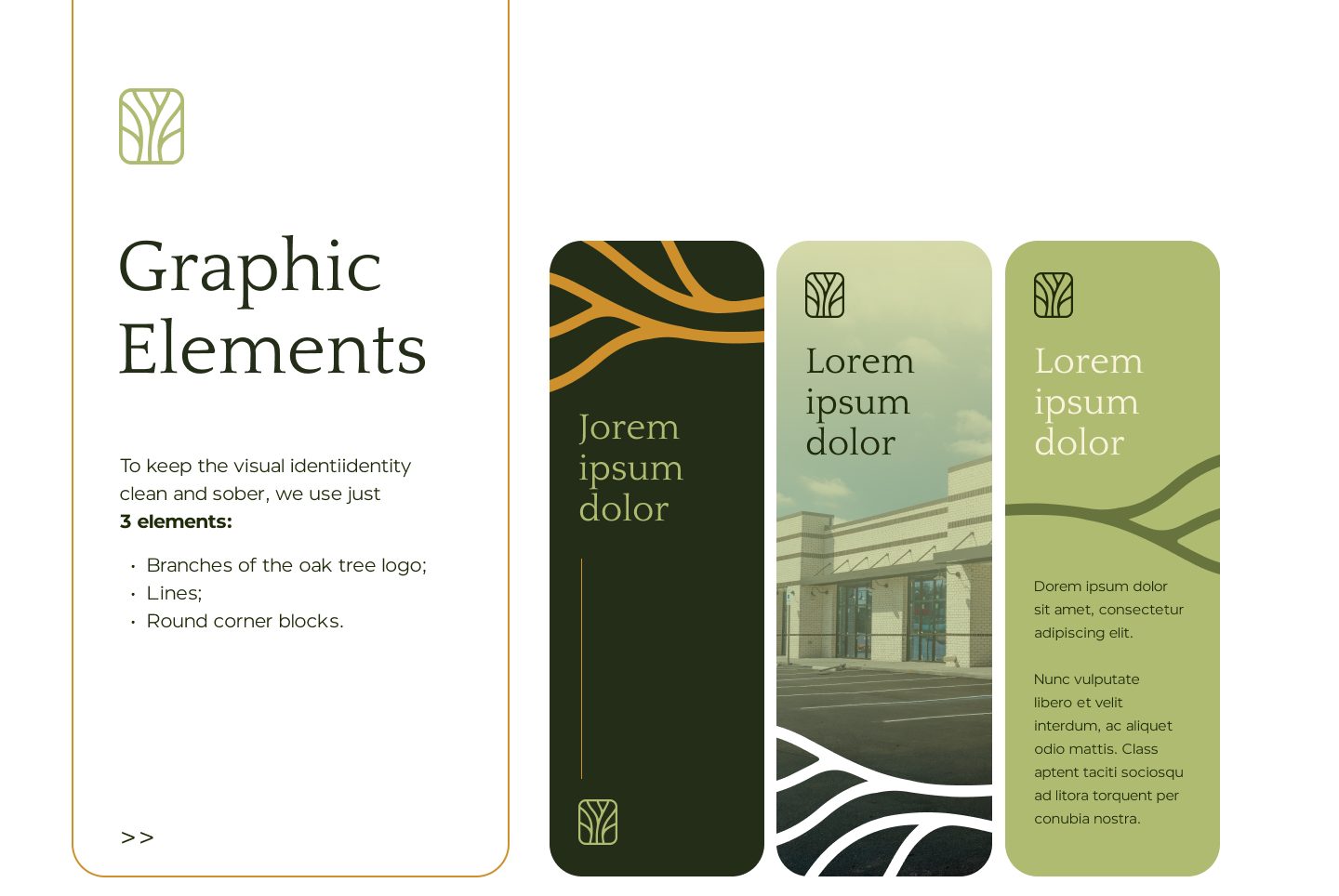
Branches, lines, rounded corners.
Three elements keep the system calm: the oak branches, fine lines and round-cornered blocks.
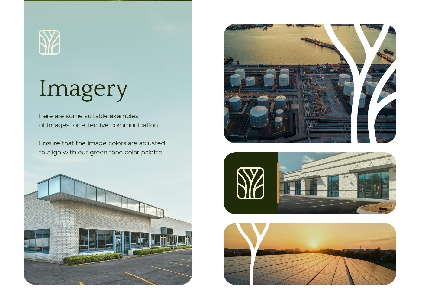
Real sites, colour-matched.
Refineries, solar farms and new buildings, adjusted to sit in the green palette and framed by the branches.
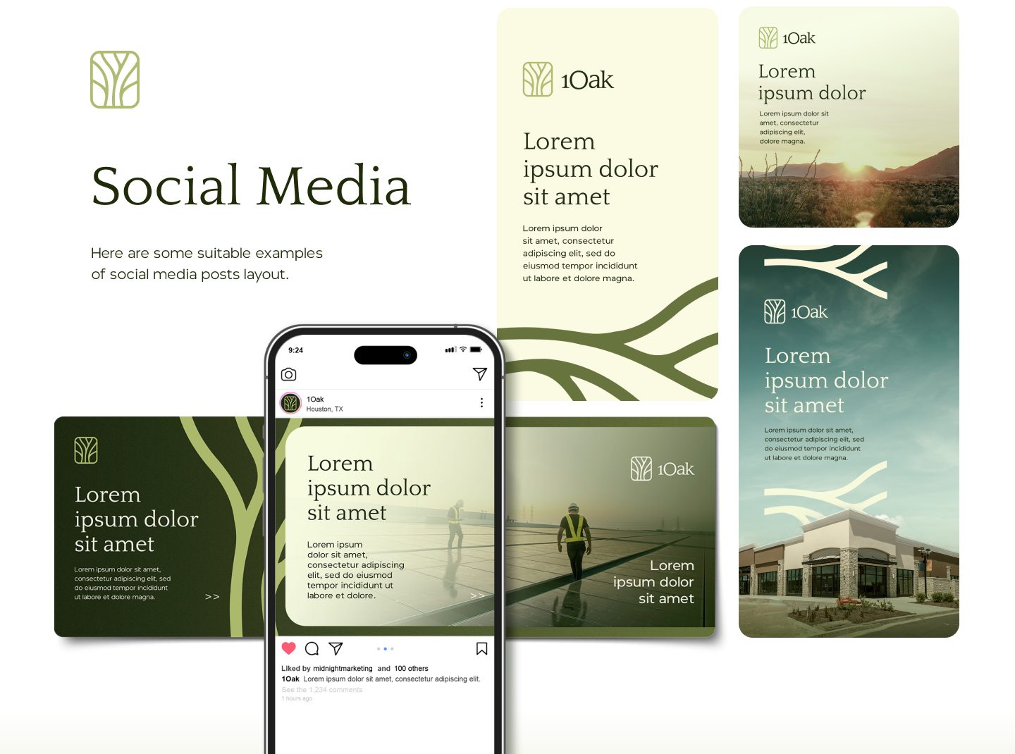
Posts that feel like the brand.
Branches frame photos and text across posts and stories, in green, cream and ochre.
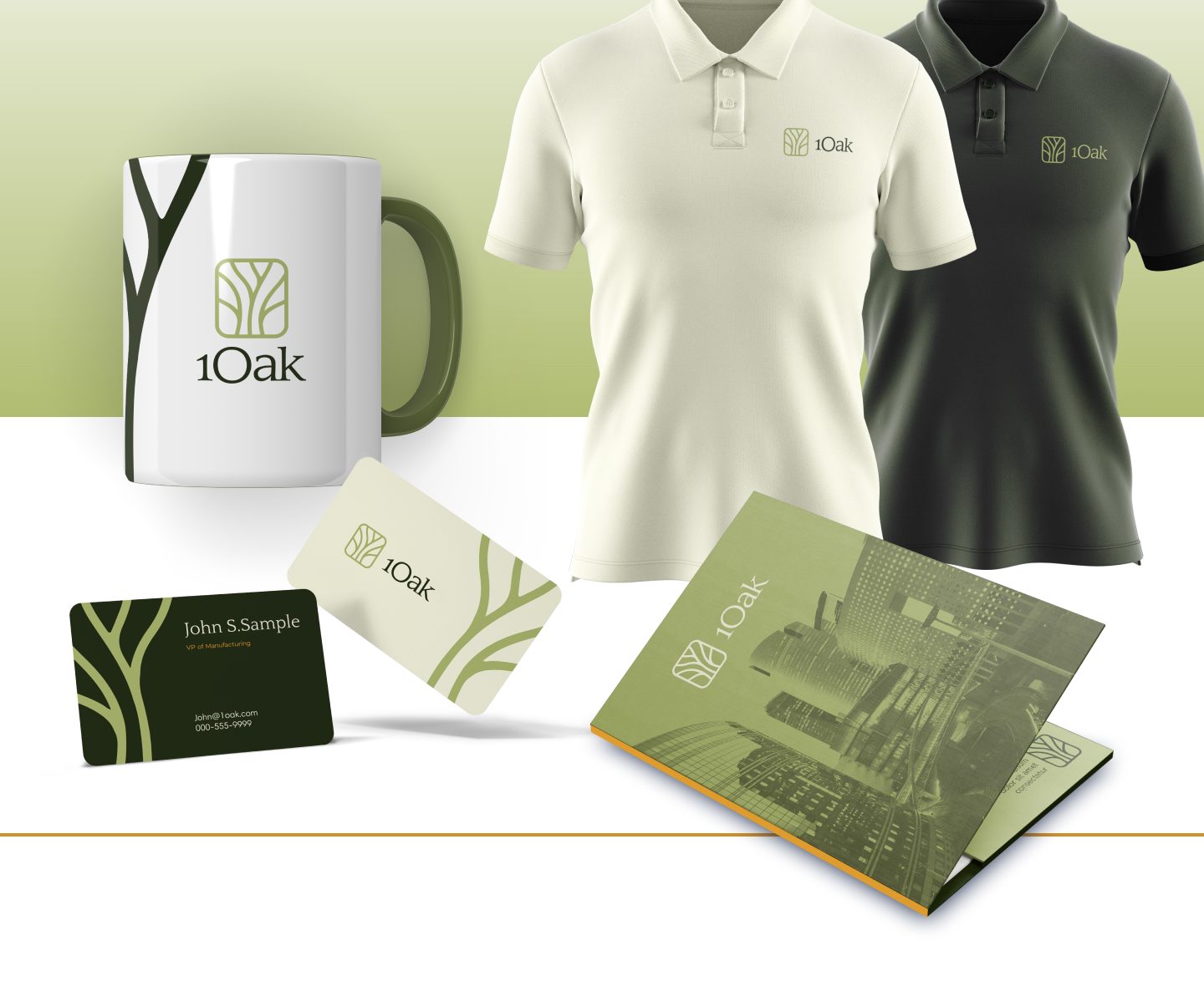
Mugs, polos and cards.
The tree mark sits quietly on polos and mugs; the branches stretch across cards and folders.
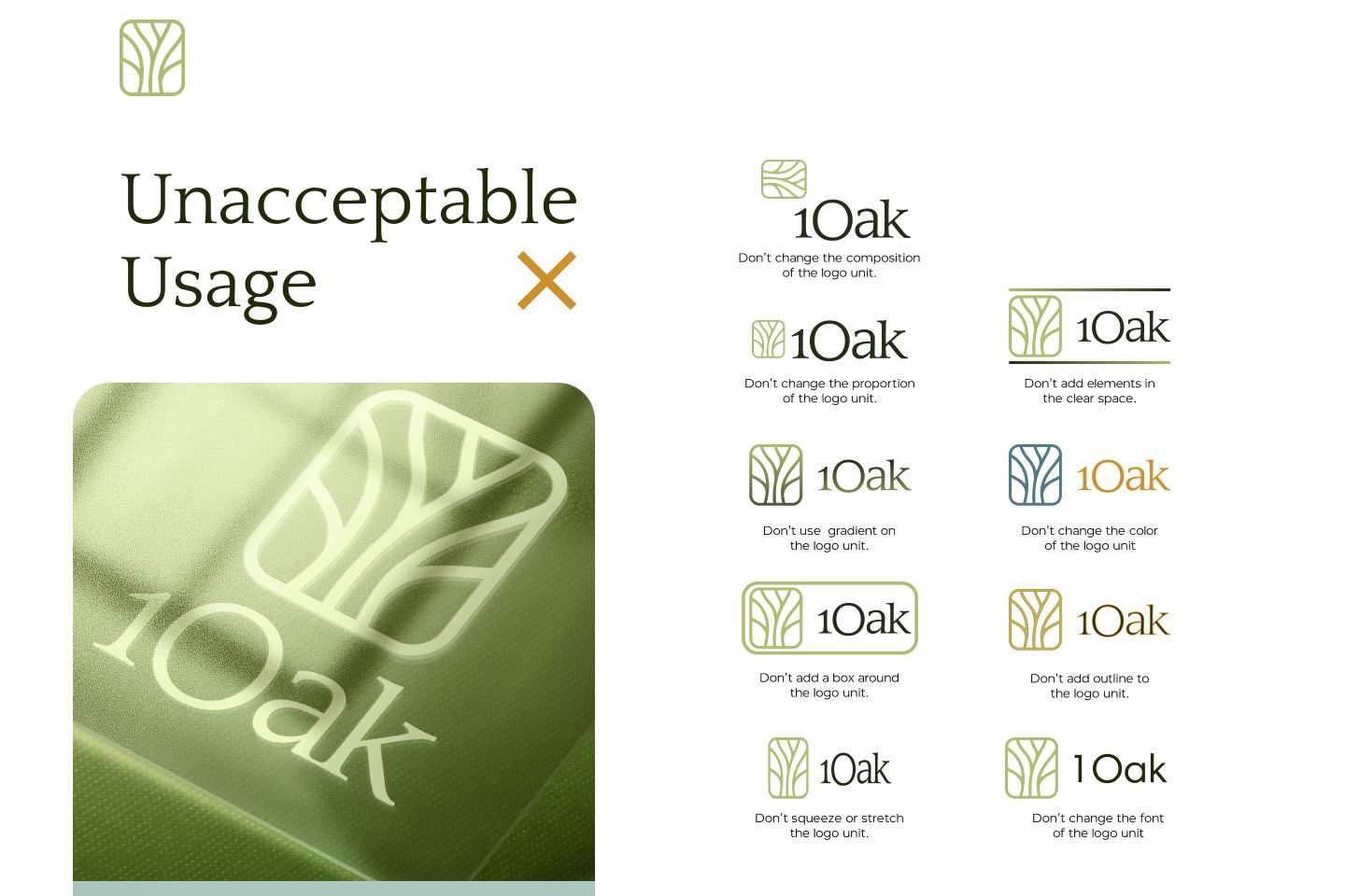
Keep the oak whole.
No recomposing, gradients, boxes, recolouring or crowding the clear space.
Liked what we did for 1Oak?
Book a free 30-minute session. Tell us where your brand is now and where you want it to go, and we’ll tell you honestly what it would take. Got a quick question instead? Just ask.