Mint Dentistry logo

A tooth drawn as one unbroken line.

Mint is Red Leaf’s everyday family clinic: check-ups, cleanings, the dentist you’ve had for years. It needed to feel fresh and modern without losing the warmth of a neighbourhood practice.

ClientMint Dentistry
GroupRed Leaf Dental
SectorFamily dentistry
Year2025
ScopeIdentity · Logo · Monogram badge · Colour · Typography · Iconography · Branding elements · Social templates · Guidelines
The challenge

Family dentistry is the most crowded corner of the market. Every clinic promises gentle care in a shade of blue, and patients can’t tell one from the next.

Our approach

Own a colour nobody else in the category dares to use, and build a mark simple enough to work as a sticker on a kid’s hand. Then add a badge, a set of icons and a tone that sounds like a friendly receptionist, not a brochure.

Positioning

Where Mint Dentistry sits.

Before anything was drawn, we agreed one sentence. Every design decision after it was checked against it.

POSITIONING STATEMENT
FORlocal families
WHOwant a dentist they can tell apart and actually remember
IT’S THEfamily dental clinic
THATowns a colour nobody else in the category dares to use
BECAUSEa one-line mark simple enough to be a sticker on a kid’s hand
THE MARKET MAP
FRIENDLYFORMAL FORGETTABLEDISTINCTIVE The category Mint Dentistry
THE CATEGORY SAYSGentle care in a shade of blue.
MINT DENTISTRY SAYSThe bright green door everyone remembers.
VALUE PILLARS
01MemorableA colour that owns the street.
02FriendlyA voice like the receptionist, not the brochure.
03SimpleOne unbroken line, from sign to sticker.
The mark

One line, no breaks.

01

A tooth and a smile. The outline loops back inside itself, so the crown doubles as a smiling mouth.

02

Same stroke as the letters. The mark’s line weight and round ends match the lowercase “mint”, so they lock up as one.

03

Built to be stamped. A circular badge wraps the name around the tooth for stickers, uniforms and social avatars.
Green you can hear.

Electric lime gets attention on a busy high street. Deep teal keeps it trustworthy. Soft mint tints keep forms and waiting rooms calm.

#1DF800
Signal limeThe shout. Signage and social only.
#00F88C
MintThe brand colour. Fresh, clean, awake.
#02D7AF
AquaWater and freshness. Panels and cards.
#1F4045
Deep tealThe voice. Every word sits on or in this.
#287274
TealDepth for gradients and dark layouts.
#E9F8F1
MistThe calm background behind it all.
In use

A fresh take on dental care.

Filled icons with rounded corners cover every service, from check-ups to braces. Lines like “Every smile, every generation” and “Where families come first” keep the tone warm.
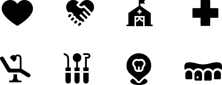

Mint Dentistry icon set
Mint social post: A fresh take on dental care
Imagery in use

Fresh light, real smiles.

Bright and high-key, never clinical blue. The tooth shape crops the photo and the green turns up in every frame.


Fresh starts here.
BILLBOARD
Smile like you mean it.
SOCIAL POST
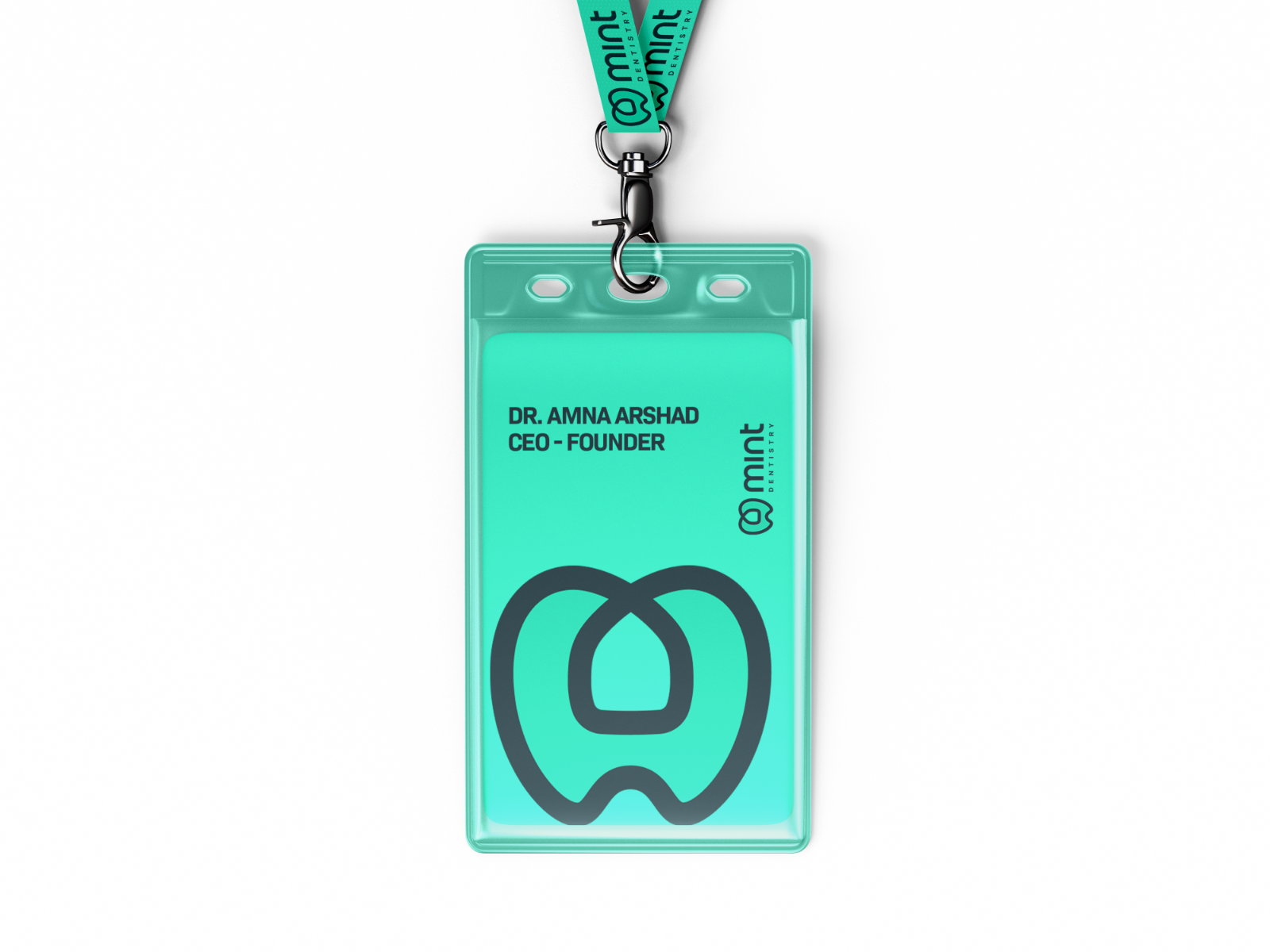
STAFF LANYARD
01

Bright, high-key light. Never clinical blue.

02

Patients first, instruments second.

03

The tooth shape is the crop. Green fills the rest.

Example photography from Pexels, used to show the direction.

Website concept

Mint Dentistry, online.

A fresh, fast clinic site: pick a treatment, see the next free slot and book in under a minute.

See our web design work
mintdentistry.com
Your turn

Liked what we did for Mint?

Book a free 30-minute session. Tell us where your brand is now and where you want it to go, and we’ll tell you honestly what it would take. Got a quick question instead? Just ask.

Book a session Ask us anything We reply within one working day.
Next case study Luminis