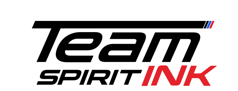
The name has three words and a lot of energy. The logo had to hold all of it without turning into a sticker-bomb, and stay readable from across a room or a track.
Treat it like motorsport. One heavy italic “Team” sets the speed, a lighter “Spirit” follows, and “Ink” carries the colour. A thin bar with three coloured stripes ties it together like a livery.
Where Team Spirit Ink sits.
Before anything was drawn, we agreed one sentence. Every design decision after it was checked against it.
Speed, then spirit, then ink.
Italic and wide. Every letter is slanted and stretched, the way type looks painted on a car door at 200 km/h.
The roofline bar. A heavy bar runs over “Team” and ends in three coloured stripes, a nod to racing liveries.
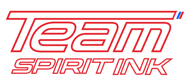
On black, it’s outlined. The dark version switches to white with a red keyline, so it glows like a night race instead of disappearing.
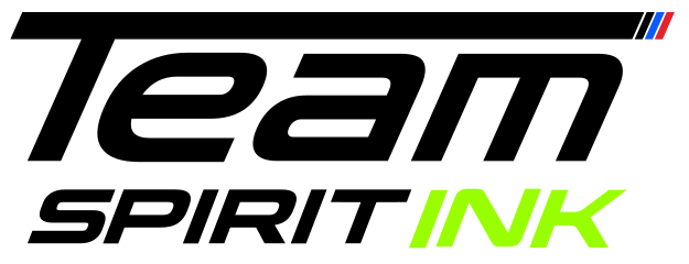
Only INK changes colour: red for the core brand, acid green for the second line. Everything else stays fixed, so it’s always recognisable.
Ink on cotton, up close.
Show the craft: the press, the squeegee, the hands. Photos go high-contrast mono, and red is the only colour added on top.
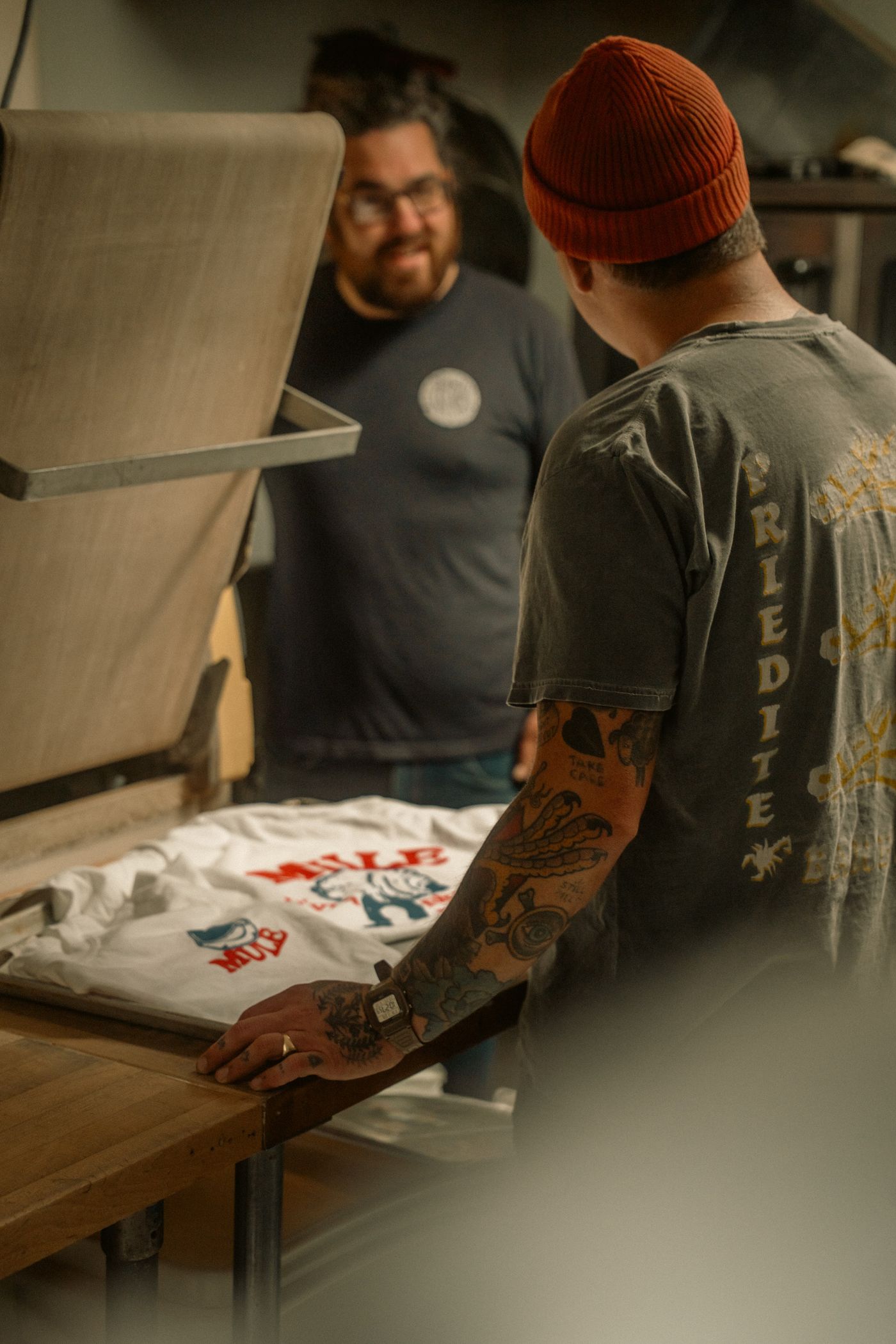


Show the press, the squeegee and the hands.
Photos go mono and high contrast.
Red is the only colour we add.
Example photography from Pexels, used to show the direction.
Liked what we did for Team Spirit Ink?
Book a free 30-minute session. Tell us where your brand is now and where you want it to go, and we’ll tell you honestly what it would take. Got a quick question instead? Just ask.